
Creating a peaceful and relaxing home environment often starts with the colors you choose for your walls and décor. Calm colors can help reduce stress, promote tranquility, and make your living space feel cozy and inviting. Whether you’re redecorating a single room or your entire home, selecting the right hues can transform your space into a restful retreat.
In this post, we’ll explore helpful tips for choosing calm colors that suit your style and needs. From understanding color psychology to popular color palettes, these guidelines will help you create the soothing atmosphere you want.
Why Choose Calm Colors?
Calm colors typically include soft blues, gentle greens, muted neutrals, and pastel shades. These hues are known for their ability to:
– Reduce feelings of anxiety and stress
– Encourage relaxation and peacefulness
– Create a sense of balance and harmony
– Make rooms feel brighter and more spacious
Using calm colors in your home can benefit everyone, whether you work from home, have a busy family, or simply want a serene space to unwind.
Consider the Room’s Purpose
Before picking colors, think about how each room will be used. Different colors work better in different spaces depending on the mood you want to create.
Bedrooms
Opt for soft shades like powder blue, lavender, or pale gray to encourage restful sleep and relaxation. Avoid bright or overly stimulating colors.
Living Rooms
Choose warm neutrals or calming greens to create a welcoming and cozy area for family and guests.
Bathrooms
Light blues, seafoam greens, or crisp whites can evoke cleanliness and freshness while promoting calmness.
Home Offices
Soft blues or muted earth tones can help maintain focus without causing distractions or fatigue.
Understand Color Psychology
Colors influence mood and emotions in powerful ways. Here are some common calm color choices and what they typically evoke:
– Blue: Serenity, trust, and relaxation
– Green: Renewal, balance, and calmness
– Gray: Neutrality, sophistication, and stability
– Beige/Taupe: Warmth, comfort, and simplicity
– Lavender: Tranquility, softness, and peace
Keep in mind that your personal preferences and experiences also affect how you respond to colors.
Tips for Choosing the Right Shades
Test Samples in Different Lighting
Colors can look very different depending on natural light, artificial lighting, and time of day. Always test paint samples on your walls and observe how they appear at various times before committing.
Balance with Neutrals
Even calm color palettes benefit from neutral accents like white, cream, or soft brown. These shades create contrast and prevent a space from feeling flat or monotonous.
Use Color Layers
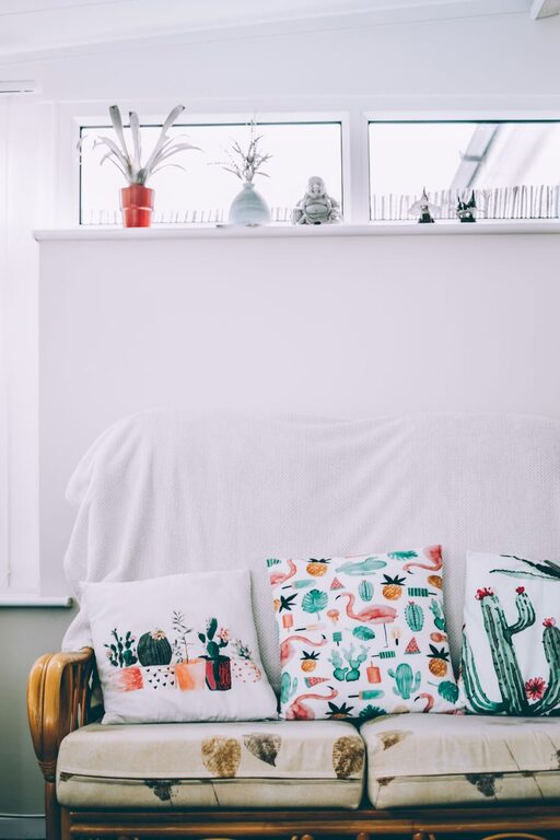
Instead of painting all walls one color, consider layering with varied shades—perhaps a feature wall or colored accents in furniture, pillows, and rugs. This adds depth and visual interest while maintaining a calm atmosphere.
Consider Texture and Finish
Matte and eggshell finishes soften colors and reduce glare, enhancing the calming effect. Incorporate textures like woven fabrics, wood, or stone to enrich the space without overwhelming it.
Popular Calm Color Palettes
Here are a few color combinations that are known to create peaceful vibes:
– Soft Blue + Crisp White + Warm Beige
Classic and airy, perfect for coastal or traditional styles.
– Sage Green + Light Gray + Natural Wood Tones
Earthy and grounded, ideal for modern or rustic interiors.
– Lavender + Pale Pink + Cream
Gentle and feminine, suited for bedrooms or cozy sitting areas.
– Dusty Blue + Soft Taupe + Charcoal Accents
Sophisticated and calming, great for living rooms or studies.
Additional Tips for a Calm Home Environment
– Keep Your Space Clutter-Free: A tidy room feels more peaceful regardless of color. Use smart storage solutions to stay organized.
– Add Natural Elements: Plants, water features, and natural wood can complement calm colors and improve indoor air quality.
– Use Soft Lighting: Avoid harsh overhead lights; instead, opt for lamps, candles, or dimmable bulbs to create a soothing ambiance.
Final Thoughts
Choosing calm colors for your home doesn’t have to be overwhelming. By considering the room’s function, lighting, and your personal preferences, you can select colors that enhance well-being and comfort. Remember that calmness is about balance—use soft colors, incorporate textures, and layer your design elements thoughtfully.
Take your time experimenting with samples and enjoy the process of turning your home into a relaxing sanctuary. With the right colors and a little creativity, you’ll create a space that feels peaceful and welcoming every day.
Related Posts
Quick Ideas to Brighten a Dark Room and Make It Feel Spacious
A dark room can make your living space feel cramped,…